It’s the ultimate paradox. The same technologies that are exponentially growing the volume of data available are also shrinking the attention spans of the humans who need to figure out what the data means and what to do with it. Adding to the irony is that the solution to this modern problem is old-fashioned: Tell a good story. But as many research professionals can attest: This is easier said than done when you have hundreds of pages of data and your boss wants a few headlines and slides yesterday. Complicating matters further is the myth that the key to good storytelling is just a pretty chart.
So what exactly is data storytelling – and how do you do it well? With hundreds of years of combined experience helping clients extract actionable business insights from server farms full of data, we thought we would share what we’ve learned on this important topic and how dashboards can not only visualize the story but help shape it.
First things first: What is a data story (and what isn’t)?
Let’s tackle the definition first. “Data storytelling is identifying the patterns in data,” says Michael Edwards, Co-Founder and Chief Growth Officer for Dig. “It’s finding and visualizing patterns that point to a truth such as a consumer need or desire. It’s turning ones and zeroes into a map so you can see how things relate to each other.”
Michael points to the map of Napoleon’s Russian campaign by Charles Joseph Minard as a classic example, which visualizes six types of data across two dimensions, including the route, freezing temperatures and declining army size as Napoleon approached and then retreated from Moscow.
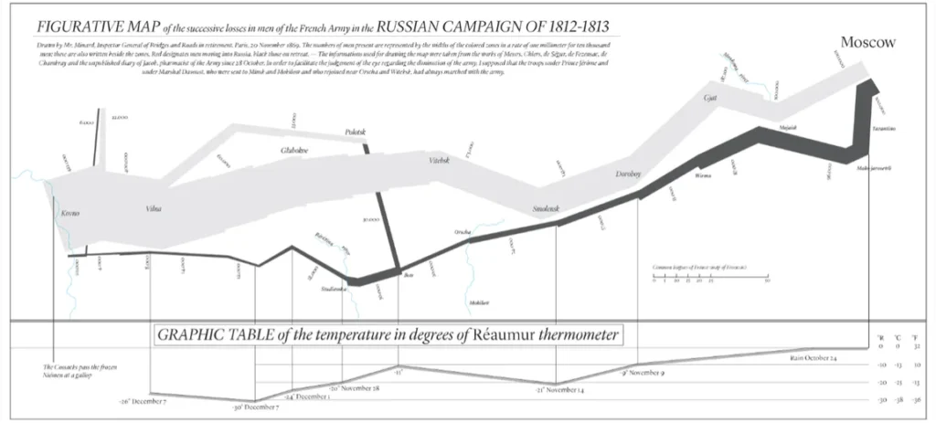
He says it’s the gold standard for data storytelling because it makes abstract data much easier to understand. If the data points were presented separately, it would take a lot longer to interpret how they all relate to each other. “Only once we have this intuitive understanding of data can we make data-informed decisions,” Michael says. “Over 100 years later, Dig still uses Sankey charts, which are a key component of Minard’s map.”
That means it’s about much more than a pretty slide or graphic. “You have to think, ‘What’s my story, how do I convey that to my client in an engaging way?’”, says Steve McCurdy, Vice-President, Insights at Dig. “That’s separate from, ‘How do I visualize that story effectively?’ Data storytelling is when you pull both of those together.”
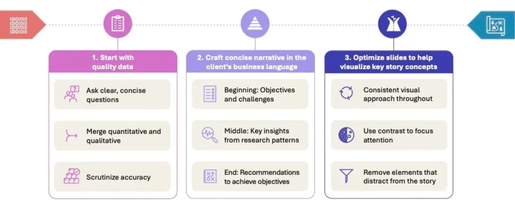
We’ve learned that there are three essential elements to a compelling and impactful data story: High-quality and accurate data, a concise narrative in the client’s business language and optimized visuals that reinforce the narrative. Let’s take a close look at each piece.
1. High-quality data: “Starts with asking the right questions”
Quality data must serve as the foundation for a good data story. It sounds obvious but data quality can easily be overlooked and then derail a project. So how do we define quality data? “Well first it’s got to be true,” Michael says. “One of the great weaknesses of research is you can ask people anything and they will give you an answer. You can have these long rambling unclear questions and to proceed in the survey people have to click something and so they do. It starts with asking the right questions.”
The quality of the responses to those questions is also key. While most research platforms implement quality checks to filter out profanity, speeding and professional respondents, Michael points out that Dig goes one step further with 9 discrete quality checks that occur before, during and after responses come in. If at any point a respondent’s answers do not meet our quality threshold, he says they’re removed from the study, along with their prior responses and automatically replaced with someone else.
The data set should also integrate quantitative, qualitative and behavioural data if available, such as data on buying patterns. “Good storytelling is a combination of quant data and qual response: Two faces of research to define one story,” says Nadia Antropova, Vice-President, Insights at Dig. “It’s not just about showing numbers, it’s overlaying responses to bring in the consumer lens. It’s about bringing it all together.”
The qualitative data is exploratory and allows you to think expansively. The quantitative data is about focusing and identifying the right answer. “When you bring them together, you have some truth,” Michael says. “You know what you’re talking about is real and can proceed with finding the patterns.”
2. Concise narrative in the client’s language: “Uber right, uber tight and transformative”
Once you’ve analyzed the data, the tough part begins: Crafting a very concise narrative that summarizes the most important high-level takeaways with recommendations on what to do next. It’s not an easy task to filter and distil what can sometimes be 100 slides worth of research into 3-5 but it’s essential in today’s attention-starved world where simplicity rules. “The story needs to have a level of clarity and simplicity to it so the client can bring it to their key stakeholders and tell them in 10 minutes what they need to know and not get bogged down in data,” Steve says.
The narrative also needs to be grounded in the client’s language to maximize impact. That means referring to their metrics, their challenges and opportunities while being sensitive to the nuances of their culture. The core team developing the narrative needs to be immersed in the client’s business to be able to confidently speak their language and maximize the impact of the insights.
“The more you hear those conversations, the more you realize the depth with which you need to go is not that deep,” says Kevin Hare, Executive Vice-President, Insights at Dig. “You better know all the detail, but you don’t actually need to present 98% of that detail.”
“It’s our job to remove unnecessary noise and shine a light on what’s important,” says Erin Cohen, Director, Insights at Restaurant Brands International. “Knowing your stakeholders – that’s what it starts with. Know the culture, how they absorb data, the things that are most important in context. It’s so different in every organization.”
The story itself follows a simple arc:
- The beginning sets the stage with context by summarizing why the research was conducted: What questions you’re trying to answer and the business challenges you’re trying to solve.
- The middle identifies the most important high-level patterns identified after analyzing the data, including patterns that weren’t necessarily in scope but would be useful for the client to know.
- The ending answers the “now what?” with recommendations on how to action the insights.
“In today’s world your story needs to be uber right, uber tight and transformative,” says Caroline Freaks, Vice-President, Insights at Dig. “It inspires the client to act and they know what to do next. To be transformative, they need to feel like they came up with the idea so we have to plant the seed to facilitate them getting where they need to go.”
The power of the dashboard
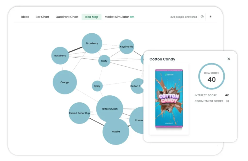
Visuals can play a powerful role in not only bringing your story to life but also in shaping the story itself. In addition to the classic slide deck, dashboards are emerging as an innovative and intuitive way to visualize and interact with research data – essentially an automated data visualization engine. Dig’s Upsiide platform often eliminates the need for a deck altogether and brings data to life in real-time by visualizing innovation territories, market structures and the relationship between things that you test.
“Upsiide has replaced a lot of concept testing reports,” Kevin says. “We’ve turned what used to be a 15-20 page deck into an interactive dashboard. We can tell a story with a web browser as opposed to a deck.”
Michael points to Upsiide’s idea map as a particularly useful part of the platform, which visualizes consumer behaviour towards different products. “When you have these types of visualizations, the conversation changes from, ‘This is better than that’ to ‘Here are the opportunities’. You’re talking about how the market is structured and how we’re going to fit. It changes the conversation to be a bit more interesting.”
3. Optimizing visuals to reinforce your story: Consistency, contrast and simplicity
If a dashboard can’t help you tell the complete story, it’s important to develop a slide deck that supports and reinforces all of your key messages. Any data or visual element that distracts from the story has to go. That means being thoughtful about the content as well as the format of the slides.
“It’s not just about pretty charts. It’s about what data to visualize and what not,” Kevin says. “Some people earlier in their career feel this compulsion to tell everybody everything. Is it relevant? Is it just going to get people distracted? Sometimes less is more and simplicity is what you need. It’s a means not an end.”
“When it comes to optimizing slides, there are three things to focus on: Consistency, contrast and simplicity,” says Graham Matthews, Senior Director at brand consulting boutique Vivid Connections. “This reduces the visual distractions and makes it much easier for the audience to understand the story.”
That means ensuring a consistent approach to elements like fonts, colors and spacing so that a chart using a different colour scheme than the previous page doesn’t distract attention away from a key message. “You want to give people a clear reference point so they can follow chart to chart,” Steve says. “You need to be very careful about color and ask, ‘Where do I want people’s attention to go when they see this chart?’”
Contrast can help you focus the audience’s attention on a key element – so using a dark color on the key bar of a graph with the other categories in a lighter colour or using an icon, photo or illustration to mix up the layout.
The slide headline is an easy way to summarize the key message on the page and how it connects to the overall story – but it can also disrupt the flow if you’re not careful. Headlines that just summarize the slide’s data were flagged by almost everyone we consulted as a common frustration and distraction.
Balancing the need for speed
As expectations rise around the simplicity of a data story, clients are also increasingly asking for them faster. Tapping into the Upsiide platform helps. When that’s not an option, a strong central template and best practice library helps teams move faster while ensuring consistency. “The presentation has to look good,” says Samantha Muscia, Vice-President Insights at Dig, “so it’s important to arm your team with resources to help them raise the bar.” For large or very high-stakes projects, engaging a designer with clear direction on the narrative can also free up capacity while improving presentation quality.
At the end of the day, your story and how it’s visualized should make it easy for the audience to understand, support and act on the research. Telling a concise story based on truths in their language with intuitive visuals has been a tried-and-true recipe for Dig. “We are trying to speak to our clients in their language as opposed to asking them to learn the language of research,” Michael says. “Adding visual language also encourages people, especially those who are less comfortable with data, to interpret the data creatively and to take inspiration from our insights.”