Concept testing sounds pretty straightforward until you actually start doing it. You may have come up with ideas to test. You may even have some designs mocked up. But when it comes to writing concept descriptions in a survey, many people need help.
Part of the reason is that some beginning market researchers don’t fully understand the distinction between an idea and a concept.
So, what’s the difference between an idea and a concept?
Simply speaking, an idea is a concept in its early stage, a sort of “diamond in the rough.” (yes, we’re using an Aladdin reference). It’s not well-defined and doesn’t yet contain specific details. For example, if you want to do a product test for a chocolate bar, you might not yet know what the packaging will look like or the specifics around messaging.
In contrast, a concept is the opposite – a clear-cut idea (an actual “diamond”, I guess?). A concept has been validated and properly scoped. In the example of the chocolate bar, you’d probably know what color the packaging would be, how you’d describe the texture and taste, and more.
To many people, the words ‘idea’ and ‘concept’ can be used interchangeably. But in the context of survey research, you should know that building a concept is much more detailed, as compared to just describing an idea. More on that below!
Want to learn what concept testing actually takes? Read this article to learn some key definitions, use cases and methods.
Old ways of writing a concept don’t work anymore
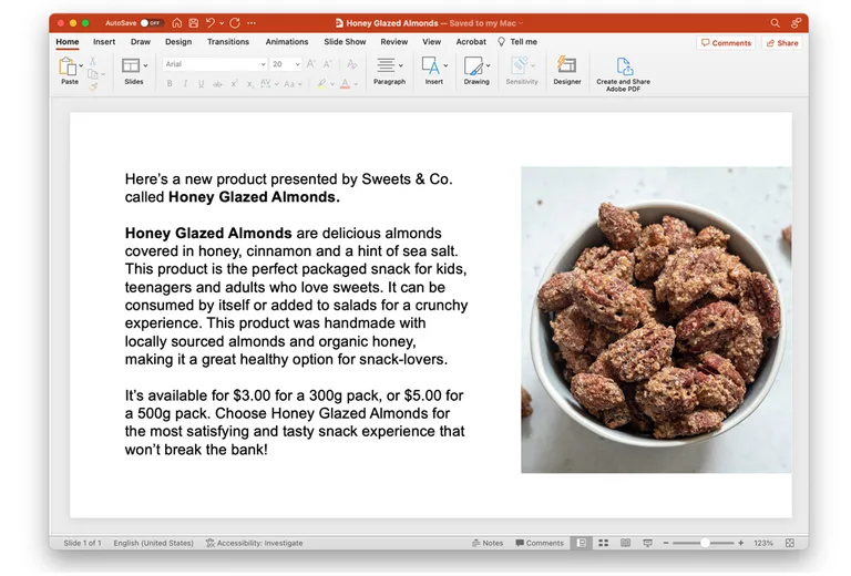
Back in the 90s, concept writing standards were a bit different. Since quite a lot of work was done manually, raw concepts had to be described to potential customers in detail. Researchers usually used PowerPoint templates that contained long concept descriptions. A single concept description usually needed to contain these things:
- Introductory header (e.g., “Here’s a new product…”)
- Description of the innovation (e.g., what the product is and what it does)
- Benefits of the innovation (e.g., “This product can help you do this…”)
- Extra information (e.g., price or important warnings)
- A closing line (i.e., a summary sentence)
- An image

Quite a lot of info, no?
Now, just imagine reading this much text today. We bet you often don’t read anything beyond the intro header of an article. And when you have several concepts outlined this way in one survey, the respondent experience just becomes tedious.
These kinds of lengthy concepts don’t work in survey research anymore. Here’s why:
- They take a lot of work to write, especially when you are writing about your competitors’ concepts or products. This makes your innovation process bloated and overly complex.
- You are never able to communicate this much information in a real in-market situation (i.e. when people actually look at your product on the shelf and have to make a decision). So you don’t know if your test results are predictive of in-market results.
- If your idea performs well, you don’t know which elements of the concept drove that performance (i.e., is it the header or the image that made people choose the concept?). The same goes for if your concept performs poorly.
Tips for writing a concept the modern way
As specialists in modernizing research, we’d like to present some of our own tips for writing a good concept. These tips can help you make your concept more readable and your concept testing survey – more engaging.
1. Test for mobile
The world is changing, and the way people engage with surveys has changed, too. People spend such an enormous time on their phones (yeah, we’re looking at you who spent almost 6 hours on your phone today). So, respondents today kind of expect surveys to be built with mobile in mind.
So, we’d recommend that you create a template for your concept description for a better mobile experience. It could mean that your descriptions should be short and concise so that all sentences would fit on the screen without having to scroll. It could also mean that you should invest in platforms with a mobile-first experience (like Upsiide, for example 😏).
2. Present only the critical info
Respondents don’t need to read long, detailed descriptions. It’s, frankly, quite boring and doesn’t reflect how people actually read your product message in real life. That’s why you should focus on presenting the most important information upfront. For example, if you’re testing a product concept, a title and a 1-sentence description of the concept should be enough.
3. Test one message at a time
It’s tempting to write every message and claim that describes your product. “It’s healthy, it’s vegan, it’s cruelty-free”. But when doing a concept test, you should always think of 1 thing that matters most to your consumer. This might be a benefit, a flavour, or a consumer need that your innovation satisfies.
4. If you have more than one potential message, test those separately
If you aren’t sure which 1 message you should go with, test all the potential messages and claims in separate surveys. This way, you can clearly understand which one is the most optimal and go with it in the next tests.
5. Ask yourself, “Do you really need images?”
We think images aren’t always necessary in concept testing. For example, we once tested different potato chip flavors on Upsiide. Half of the sample saw packaging visuals and full written descriptions of flavors. The other half saw only the flavor descriptions.
When it came to the results, they came out the same – i.e. a chip idea performed almost identically, whether people saw visuals or just flavor descriptions. This shows that you don’t always need images in a concept test. You can actually test earlier and save time and money this way while getting the same results.
There are some outliers, though; one caveat is that imagery can be super useful if you want to depict an unfamiliar concept.
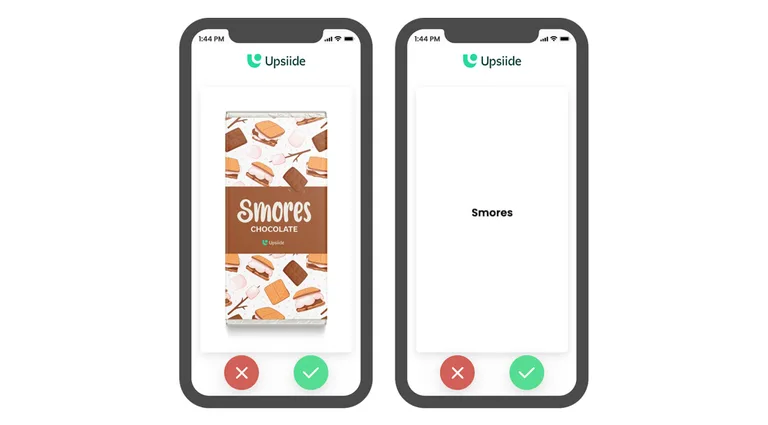
We did 2 surveys on chocolate bar flavors in the UK – one was text-only, and another contained packaging visuals. S’mores did much better in the image test compared to the text-only test. And we think it’s because people in the UK don’t know the S’mores flavor well (it’s more of a North American thing). In that case, the image helped consumers to understand the flavor better.

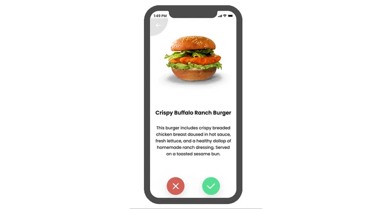
Example of a good concept description
We thought it might be useful if you saw what a good concept description looks like.

Why this concept description works:
- It’s short and concise
- It outlines the most important information
- Including an image makes sense
Btw, this is not the only way you can present your concepts on Upsiide. Experiment with 6 different formats and show your ideas however you like.
There’s so much more to concept testing
Now that you know how to write a concept, it’s time to upgrade your skills in other aspects of concept testing. If you want to learn how to write good survey questions, this article outlines some of the best practices.


